
Simplified payment processing for small businesses
Simplified payment processing for small businesses
Client
Vizypay
Role
UX Strategy, UI/UX design, Interaction Design
Timeline
6 weeks
Platform
Website Redesign
Overview
Overview
VizyPay Redesign
VizyPay Redesign
VizyPay Redesign
This is a VizyPay website redesign case study. VizyPay is a payment processing solution created to help small businesses. It offers transparent pricing, personalised customer support and innovative credit card payment solution.
This is a VizyPay website redesign case study. VizyPay is a payment processing solution created to help small businesses. It offers transparent pricing, personalised customer support and innovative credit card payment solution.
This is a VizyPay website redesign case study. VizyPay is a payment processing solution created to help small businesses. It offers transparent pricing, personalised customer support and innovative credit card payment solution.


The problem
The problem
VizyPay's current website vizypay.com isn’t reflective of their exceptional services especially because of inconsistent layout, outdated design assets, unoptimised website ux copy, generic branding, ineffective call-to-actions.
VizyPay's current website vizypay.com isn’t reflective of their exceptional services especially because of inconsistent layout, outdated design assets, unoptimised website ux copy, generic branding, ineffective call-to-actions.

PROBLEM IMPACT —
PROBLEM IMPACT —
Collectively, these issues have the potential to negatively impact users by creating confusion, frustration, and a suboptimal user experience.
Collectively, these issues have the potential to negatively impact users by creating confusion, frustration, and a suboptimal user experience.
Client
Vizypay
Role
UX Strategy, UI/UX design, Interaction Design
Timeline
6 weeks
Platform
Website Redesign
Digging into
the Problem
Digging into
the Problem
Methodology
Methodology
Methodology
Heuristic Audit
Heuristic Audit
Heuristic Audit


Redundant Call-To-Action
Redundant Call-To-Action


Outdated group photo editing and Inconsistent layout
Outdated group photo editing and Inconsistent layout


Navigation button is hidden and unintuitive, Misleading and Discrepant Call-To-Action
Navigation button is hidden and unintuitive, Misleading and Discrepant Call-To-Action


Text and Button Misalignment


Text and Button Misalignment
Text and Button Misalignment


Unnecessary extra click, Lack of call-to-action, Wasted Interface Real Estate
Unnecessary extra click, Lack of call-to-action, Wasted Interface Real Estate


No obvious layout pattern in the footer, Hover state of navigation is inaccessible
No obvious layout pattern in the footer, Hover state of navigation is inaccessible


Navigation button is hidden and unintuitive, Misleading and Discrepant Call-To-Action


THE GOAL
THE GOAL
Improve user experience, Drive conversion, Enhance user satisfaction
Improve user experience, Drive conversion, Enhance user satisfaction
Improve user experience, Drive conversion, Enhance user satisfaction
Reigniting the commitment to community and credibility
Reigniting the commitment to community and credibility


SOLUTION
SOLUTION
Crafting Delightful User Experiences
Crafting Delightful User Experiences


“Get started” caters to existing users with knowledge about VizyPay already and “Learn more” caters to new users with no previous knowledge. This aims to increases conversion
“Get started” caters to existing users with knowledge about VizyPay already and “Learn more” caters to new users with no previous knowledge. This aims to increases conversion
“Get started” caters to existing users with knowledge about VizyPay already and “Learn more” caters to new users with no previous knowledge. This aims to increases conversion
Sectioned and simplified pitch about the cores of
VizyPay and it’s commitment to small businesses.
Sectioned and simplified pitch about the cores of VizyPay and it’s commitment to small businesses.
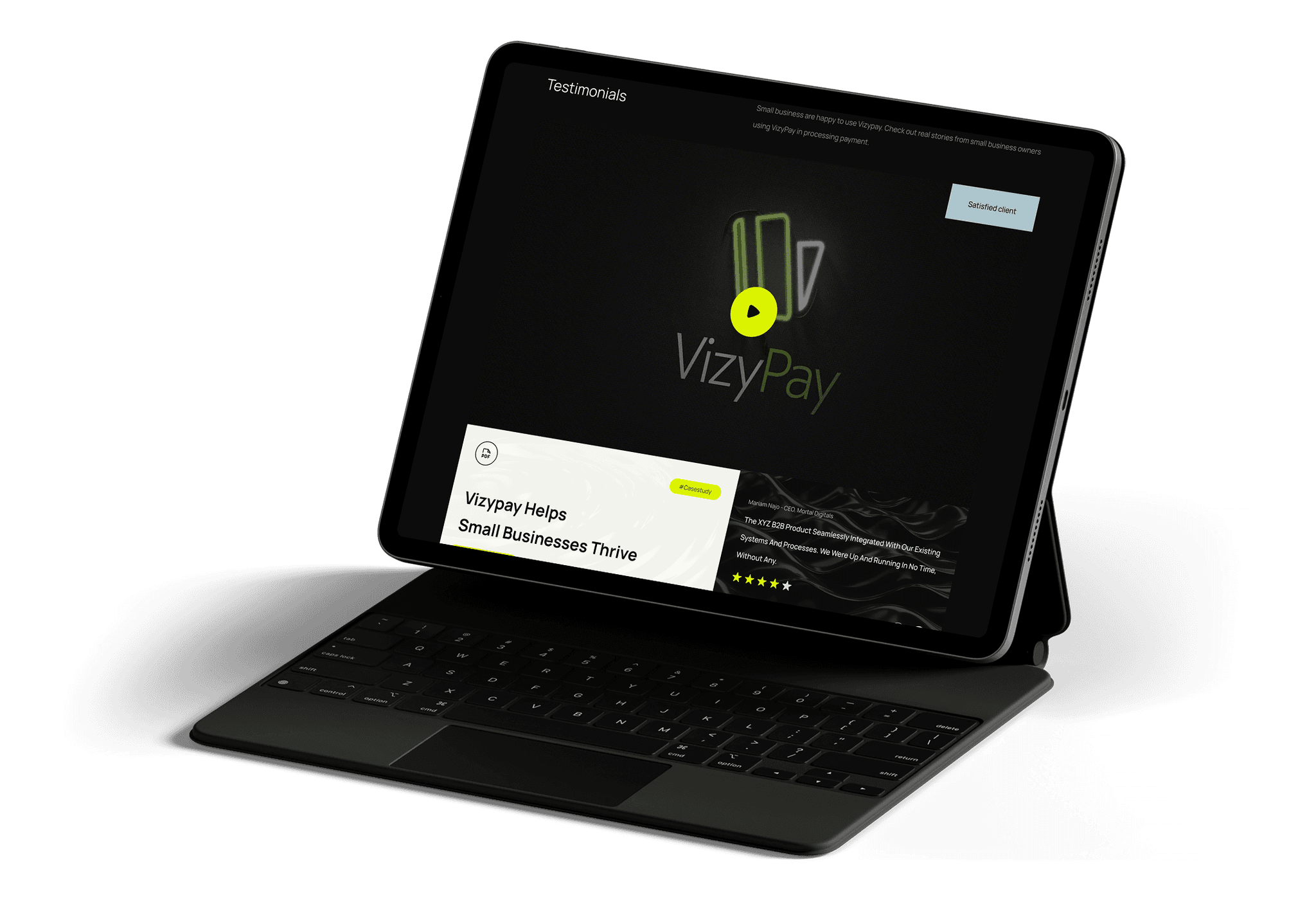
Small businesses are happy to use Vizypay.
Small businesses are happy to use Vizypay.
Small businesses are happy to use Vizypay.


Check out real life success stories,
be inspired to Grow Your Business with VizyPay
Check out real life success stories, be inspired to Grow Your Business with VizyPay
Check out real life success stories,
be inspired to Grow Your Business with VizyPay
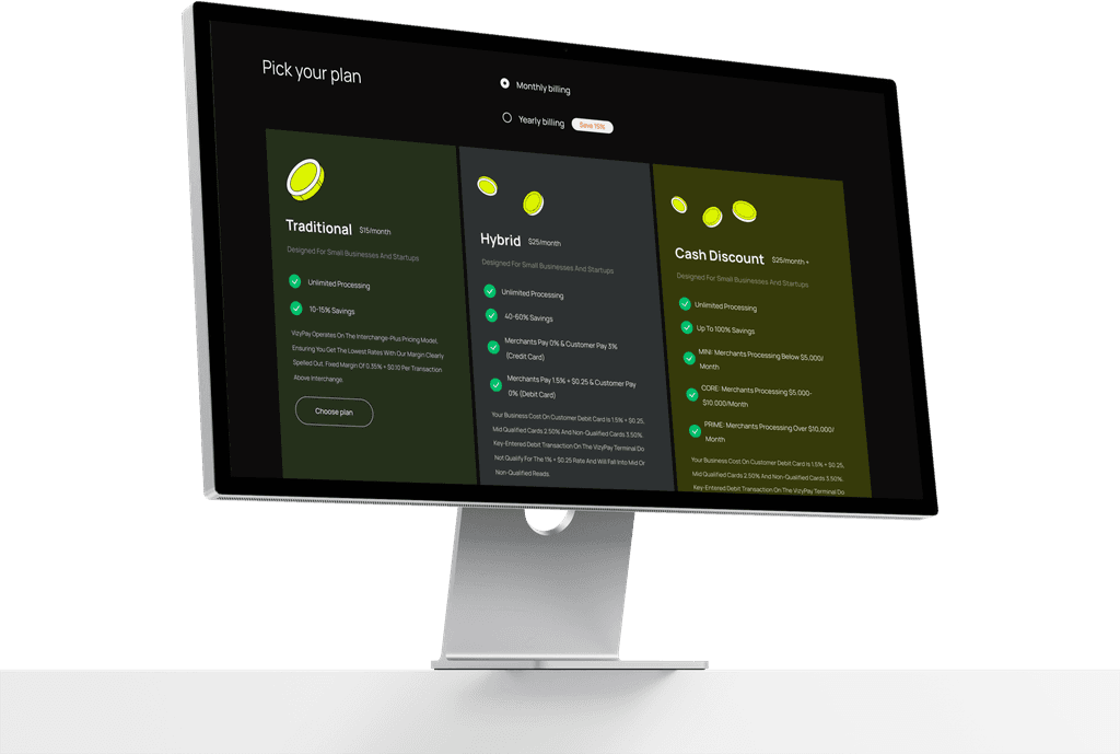


Simplified & flexible. Pick your plan. Start growing.
Simplified & flexible. Pick your plan. Start growing.
Simplified & flexible. Pick your plan. Start growing.

Design preview
Conclusion
Conclusion
Conclusion
Nothing is a coincidence
Nothing is a coincidence
Nothing is a coincidence
This redesign features strategic CTAs, intuitive page sectioning/layout, optimized copy and overall visually appealing design, leading to improved user experience, more conversion and enhanced user satisfaction.
This redesign features strategic CTAs, intuitive page sectioning/layout, optimized copy and overall visually appealing design, leading to improved user experience, more conversion and enhanced user satisfaction.
This redesign features strategic CTAs, intuitive page sectioning/layout, optimized copy and overall visually appealing design, leading to improved user experience, more conversion and enhanced user satisfaction.


View more project
View more project
FCMB · UX & Mobile design
Wealth Dashboard: Tracking shares and enhancing share cross-selling
IGNTD · User Experience Redesign
Increasing Users Engagement & Retention through UX Redesign and Gamification
Biz Hive · User Interface & Experience Design
Digitalising Onboarding and Account Mandating for Business Bankers
more projects completed on behance
FCMB · UX & Mobile design
Wealth Dashboard: Tracking shares and enhancing share cross-selling
IGNTD · User Experience Redesign
Increasing Users Engagement & Retention through UX Redesign and Gamification
Biz Hive · User Interface & Experience Design
Digitalising Onboarding and Account Mandating for Business Bankers

more projects completed on behance


The problem
VizyPay's current website vizypay.com isn’t reflective of their exceptional services especially because of inconsistent layout, outdated design assets, unoptimised website ux copy, generic branding, ineffective call-to-actions.


PROBLEM IMPACT —
Collectively, these issues have the potential to negatively impact users by creating confusion, frustration, and a suboptimal user experience.
